Bring Back the Swinging Friar Logo


The San Diego Padres have recently become marketing-obsessed.
In the last few seasons, the team has turned Petco Park into a hip place to be. With a monthly alcohol fueled celebration, young people from all walks of life have come to Petco to hang out and witness a Padres game. These beer and wine fests generate tons of income for the team, and they help educate people about how beautiful Petco really is to visit.
The ballpark has also taken over as the site in San Diego for motocross races, monster truck rallies, and even concerts. Using Petco as a multi-purpose venue is certainly smart, but I question some of the team’s marketing antics.
There will be a point when this Padres team will be very good. The minor league system is loaded, and the present team has many young players with upside. It is only a matter of time before this team is very competitive. Once that happens, Petco Park will sell out. Fans will seek out tickets to the game, and it will have nothing to do with the product on the field. The San Diego Padres, being the only professional team in San Diego, will be the pride of the city. There will be no need to “market” the team, and there will be need to have to feed the people of San Diego Padres information– they will be well aware of it, and they will want more of it. That time will come.
So with all that being said, how can the team help market themselves outside the city of San Diego? We have discussed the color scheme to death, and I am not going to go there in this particular piece. I will say that a unique color scheme will only help develop tradition for a team that has always lacked it.
Aside from the color, how can this team help tradition and cultivate a national marketing technique? The easy answer is simple.
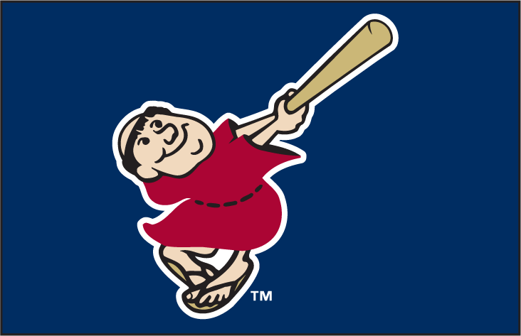
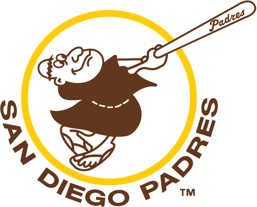
Bring back the Friar logo!
The logo was first used by the Pacific Coast League Padres in 1961. The image, originally sketched by San Diego High graduate, Carlos Hadaway, was utilized by the team from 1969-1984. It was redesigned and used from the mid 90’s on, sporadically. In fact, the Swinging Friar logo was a part of both N.L. Championship Padres teams (1984 and 1998). It represents the team and it is a great looking logo.
For some reason, the current regime has phased out the logo completely, but yet our mascot is the Friar. It makes no sense at all. The fans love the logo, and that symbol itself represents the team without having to be obvious. Having a big S and D as the logo is not creative. I agree it is classy and should remain the main logo used on all hats, but why not change it up a bit too? It is similar to the lightning bolt logo that a former favorite football team of mine uses every once in awhile. It’s a no-brainer.
Baseball fans who have never been to San Diego, nor even care about the Padres, will wear merchandise with that logo simply because it looks good.
The Milwaukee Brewers have one of the coolest old logos in the history of the game. Their glove and mitt combination that forms the letters M and B, are brilliant. I used to have a Brewers hat because that logo just looks great. The Brewers, like the Padres, phased out the logo, but recently brought it back and the fans love it. They realize they want their merchandise on people’s bodies outside of the Milwaukee area.
The “Swinging Friar” logo is a brilliant advertising tool for the team that is being neglected simply because the team is so focused on gaining fans from the incorrect market. Yes, the stands do need to be filled with fans. I understand this team is a work in progress as far as the product on the field, but there will be a point when this team needs to look at the big picture, rather than being so shortsighted.

James was born and raised in America’s Finest City. He is a passionate baseball fan with even more passion towards his hometown Padres. James has written about the Padres and their prospects for over a decade. He also writes about San Diego State as well as other local sports. James is the Editor-In-Chief of EastVillageTimes.com. Always striving to bring you the highest quality in San Diego Sports News. Original content, with original ideas, that’s our motto. Enjoy.

